Table of Contents
- Introduction
- What Exactly Is Chicano Lettering?
- The Cultural Roots: From Prison Walls to Gallery Walls
- Essential Tools for Getting Started
- The 7 Core Styles of Chicano Lettering
- Technique Deep Dive: Shadows, Flows, and Flourishes
- Modern Applications Beyond the Barrio
- Common Mistakes Beginners Make
- Resources to Level Up
- Frequently Asked Questions
- Final Thoughts
Introduction
There’s something about the way the letters curve, stack, and cast shadows that stops you mid-scroll. Bold, intricate, and undeniably cool—Chicano lettering carries decades of history in every stroke. It’s not just writing; it’s identity carved into paper, concrete, and skin.
If you’ve ever wanted to understand this iconic style or try it yourself, you’re in the right place. We’ll walk through the origins, the essential styles, the tools, and the techniques that turn simple letters into statements. Whether you’re a designer looking to expand your typography vocabulary or someone who simply appreciates the craft, this guide treats Chicano lettering with the depth and respect it deserves.
What Exactly Is Chicano Lettering?
Let’s get this straight from the beginning. Chicano lettering isn’t graffiti in the traditional sense, and it isn’t just calligraphy either. It sits somewhere in between—a hybrid of Old English blackletter, Mexican muralist traditions, and the raw resourcefulness of communities who had limited tools but unlimited creativity.
At its core, Chicano lettering refers to stylized typography born from Chicano and Mexican-American barrio culture, particularly in Southern California and the Southwest. You’ve seen it on lowrider car murals, band logos, tattoo flash sheets, and neighbourhood placas (territory markers). It’s characterised by heavy three-dimensional shading, dramatic serifs, connected letters, and a distinct flow that feels both gothic and streetwise.
The style communicates belonging. When someone writes in this script, they’re announcing, I am from here. This is my people. This is me.
The Cultural Roots: From Prison Walls to Gallery Walls
To understand Chicano lettering, you have to understand where it came from. This isn’t just design history—it’s social history.
In the 1940s and 50s, young Mexican-Americans in Los Angeles faced intense segregation. Schools discouraged Spanish. Neighbourhoods were patrolled. In response, youth created their own visual language. Chicano lettering became a way to mark territory, honour heritage, and communicate when formal systems excluded them.
Prisons played a huge role. Inside, Chicano inmates developed elaborate lettering styles using whatever they had—ballpoint pens, melted chess pieces, even toothpaste caps. Letters became elaborate. Hours were spent perfecting curves and shadows because on paper, you could build something beautiful even when your surroundings were brutal.
By the 70s and 80s, this aesthetic moved outward. Lowrider magazine covers featured hand-drawn headlines. Bands like Cypress Hill and Kid Frost wore the style on album covers. What started as survival became celebration. Today, you’ll find Chicano lettering in Nike campaigns, Netflix title sequences, and fine art exhibitions. But the soul remains the same.
Essential Tools for Getting Started
You don’t need a studio to create Chicano lettering. You just need patience and a few basics.
Pens and Markers:
- Pilot parallel pens for clean, consistent lines
- Sharpie chisel-tip markers for that classic street feel
- Fine-liner pens (0.1 to 0.5) for details and flourishes
- White gel pens for highlights and bounce light effects
Paper:
- Smooth bristol board or marker paper (toothier paper kills your pen tips)
- Tracing paper for layering and refining
Digital Tools:
- Procreate with textured brushes (search for Chicano brush sets)
- Adobe Illustrator with the width tool for controlled manipulation
- A basic drawing tablet if you’re working digitally
But honestly? Many masters started with a Bic pen and notebook paper. The tool matters less than the discipline.
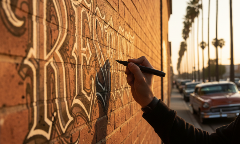
The 7 Core Styles of Chicano Lettering
Here’s where we get hands-on. These seven styles represent the foundation of Chicano lettering. Master these, and you’ll have the vocabulary to develop your own voice.
1. Old English / Gothic Blackletter
The grandfather of the style. Heavy, vertical pressure with dramatic thick-to-thin transitions. Letters feel compressed, almost stacked. When you see a band logo with sharp, cathedral-like points, that’s this style.
Practice tip: Start with uppercase. Focus on the serifs—they should look like blades.
2. Bubble Letters (Or Softies)
Round, inflated, friendly. Bubble letters emerged as a contrast to the sharpness of Old English. They’re often used for two-letter acronyms or neighbourhood initials. The key is consistent roundness and overlapping.
Practice tip: Draw the letter first as a skeleton, then inflate around it like you’re blowing up a balloon.
3. Placaso
Raw, quick, and aggressive. Placaso is the style you scrawl when you’re claiming territory or sending a message. It’s less refined but carries immediate impact. Letters tilt forward, edges are sharp, and the energy is urgent.
Practice tip: Don’t overthink it. This is meant to be fast. Use a chisel marker and commit.
4. Script / Cursive Connection
Flowing, romantic, deeply personal. This style connects every letter in a single, unbroken ribbon. Often used for women’s names, dedications, or memorials. The ascenders and descenders stretch dramatically.
Practice tip: Practice your cursive handwriting first. This style lives and dies on consistent slant.
5. 3D Block with Drop Shadow
The signature move. You write the letter, then extend the lines at a 45-degree angle to create depth. Then you fill the shadow solid black or grey. This gives Chicano lettering that iconic pop-off-the-page effect.
Practice tip: Pick one light source direction and stick to it for the entire piece.
6. Cholo Calligraphy
Ultra-refined, almost Victorian. Thin, elegant strokes with extreme contrast. This is what you’d see on a hand-drawn birthday card or a love letter sent from a cell. It’s the style that demands the steadiest hand.
Practice tip: Use a flexible nib or brush pen to achieve the thin hairlines and heavy downstrokes.
7. Hybrid / Contemporary Fusion
New school artists are blending Chicano lettering with wildstyle graffiti, Japanese calligraphy, and digital typography. Letters might have traditional shadows but unconventional proportions. Rules bend.
Practice tip: Study the old masters, then break one rule intentionally.
Technique Deep Dive: Shadows, Flows, and Flourishes
Let’s slow down and examine what separates decent lettering from masterwork.
The Shadow Rule
Almost all traditional Chicano lettering uses what artists call “the barrio drop.” Your light source is consistently top-left. Shadows fall bottom-right. The shadow is solid black, no gradient. This creates high contrast and readability from a distance.
The Connection Game
In a word or phrase, letters rarely stand alone. They connect through extended serifs or deliberate overlaps. Study how the tail of one letter becomes the entry point for the next. This flow is what makes a piece feel cohesive rather than just individual letters standing in a row.
Flourishes with Purpose
Beginners add squiggles everywhere. Masters add flourishes only where the composition needs balance. A flourish should anchor the piece, redirect the eye, or fill negative space. If it doesn’t do those things, erase it.
The Bounce
Straight baselines are rare in authentic Chicano lettering. Letters rise and fall like they’re breathing. Some letters sit slightly above the baseline, others dip below. This rhythm mimics handwriting and prevents stiffness.
Modern Applications Beyond the Barrio
For decades, Chicano lettering stayed within its community. That’s changed.
Fashion: Streetwear brands regularly commission Chicano calligraphers for logo designs. The aesthetic communicates authenticity, edge, and handcrafted quality that sterile sans-serifs can’t touch.
Tattoo Art: This is perhaps the most visible space. Black and grey realism portraits are often paired with Chicano lettering for names, dates, and dedications. Tattooers who master this style stay booked solid.
Music Industry: From corridos to hip-hop, album art relies on this typography to signal cultural roots. Even non-Latinx artists have adopted the style for its visual weight.
Commercial Design: Major brands now seek out Chicano artists directly rather than copying the style. This shift matters. It means the culture bearers are finally credited and compensated.
Common Mistakes Beginners Make
Let’s save you some frustration.
Mistake 1: Overcomplicating Too Fast
You see a finished piece with wild flourishes and 3D shadows and think, I’ll start there. You won’t. Start with single letters. Get the structure right before adding the bells and whistles.
Mistake 2: Ignoring the Baseline
Letters floating at different heights without intention look sloppy, not stylized. If you’re going to bounce, bounce with rhythm. If you’re going to stay flat, lock it down.
Mistake 3: Shadows That Wander
Pick a light source. Stay with it. Half your letters casting shadows right and half casting left makes the piece feel broken.
Mistake 4: Cultural Tourism
This isn’t just a font pack. Chicano lettering carries weight. Approach it with respect, learn the history, credit your influences. Don’t just extract the aesthetic.
Resources to Level Up
Books:
- Cholo Writing: Latino Gang Graffiti in Los Angeles by Francois Chastanet
- Black and Grey Tattoo by Jack Rudy (he literally pioneered the style)
Instagram Accounts to Study:
- @mr_gato1 (legendary San Jose artist)
- @chazboogie (contemporary master)
- @notsharpe (next generation fusion)
Practice Exercises:
- Copy one alphabet style five times from reference
- Write your neighbourhood or city name in three different styles
- Redraw a classic lowrider magazine masthead by hand
- Try a digital piece after you’ve nailed paper
Frequently Asked Questions
Is Chicano lettering the same as graffiti?
Related but distinct. Graffiti prioritises speed, scale, and wildstyle complexity. Chicano lettering prioritises precision, readability, and ornamental detail. They overlap but aren’t identical.
Do I need to be Chicano to practice this style?
You don’t need to be Chicano to study and respect the craft. You do need to acknowledge where it came from and avoid presenting it as your own invention. Crediting lineage matters.
How long does it take to get good?
With daily practice, you’ll see serious improvement in three months. Mastery takes years. The artists who excel are the ones who treat it as a discipline, not a casual hobby.
Can I make a career from this?
Absolutely. Tattooing, graphic design, mural work, and commercial commissions all offer paths. Build a portfolio, be consistent on social media, and network within the community.
Final Thoughts
Chicano lettering is more than an aesthetic trend. It’s a lineage of creativity born from constraint, beauty carved out of concrete and paper by people who refused to be invisible.
Whether you’re picking up a pen for the first time or you’ve been drawing letters since childhood, this craft rewards patience. Every shadow you lay down carries the echo of someone forty years ago, doing the same thing with a Bic pen in a dim room, trying to make their name mean something.
So study the history. Respect the culture. Put in the hours. And let your letters speak.